Tata is a fairly big car brand, although it’s not too familiar to people anywhere besides India and some Asian countries. It is, after all, mostly an Indian brand, and they mostly only create the cars for their home market. Regardless of that, there is a lot to say about them and their brand, even if you’ll rarely see any of their products.
Meaning and History
![]()
The company behind the cars is called Tata Motors, and it’s really a subsidiary of a larger Tata Group, which creates a lot of other products. Evidently, they only created their logo because the car industry demands recognizable emblems. In 1945, they’ve started their car business and made the logo for it, which the two now share.
1945 – 1988
![]()
The first Tata logo was black and white. It was depicted in the form of a circle, along the perimeter of which laurel twigs were depicted, and the name of the brand was written on top and bottom. A large letter “T” was depicted in the center of the circle.
1988 – 2003
![]()
Much like other companies that start with ‘T’ (including Toyota, Tesla and many others), Tata used this letter as a primary image in their logo. They didn’t use it willy-nilly, however, and styled it somewhat as a road to give away the purpose of their brand.
Here’s the way it looks: there’s a lilac oval with two boomerang-shaped lines that start in the bottom of this shape, proceed in parallel up to the middle of it and then part ways to the opposite sides of the figure. So, it naturally looks like a ‘T’, but the stem is separated in two halves, which makes it look like a road with the dividing line on it.
The text beneath the logo uses the same color as the emblem. The writing is very simplistic, because there are only two letters in this word, and both are written with as little detail as possible. Each letter only gets two wide blocky lines. It’s obvious with ‘T’, but the ‘A’ is cleverly written as a reverse ‘V’.
On the corporal property, the logo is sometimes accompanied by the word ‘Motors’ in a simple thin font. Often there isn’t even an emblem, and the company just uses its full name in these instances, with ‘Tata’ written in the style identical to that beneath the emblem.
There isn’t really an explanation for the choice of the lilac color.
2003 – now
![]()
At the moment, the Tata logo is just a brand name written in a specially designed designer font. The letter font is based on the classic Helvetica font. At the same time, the two letters “A” have no horizontal bars. The brand name is written in blue.
2025 (tentative)
![]()
In 2023 the globally famous automaking brand has introduced a new logo, which Tata is going to start using for its cars in 2025. The new badge is based on gust a graphical emblem, composed of two mirrored parts, which make up a stylish geometric capital letter “T”, drawn in black lines against a plain white background. The letter has its vertical part bold and stable, while the horizontal bars of the parts are drawn in thin straight elongated lines. The new concept has no lettering in it.
Emblem and Symbol
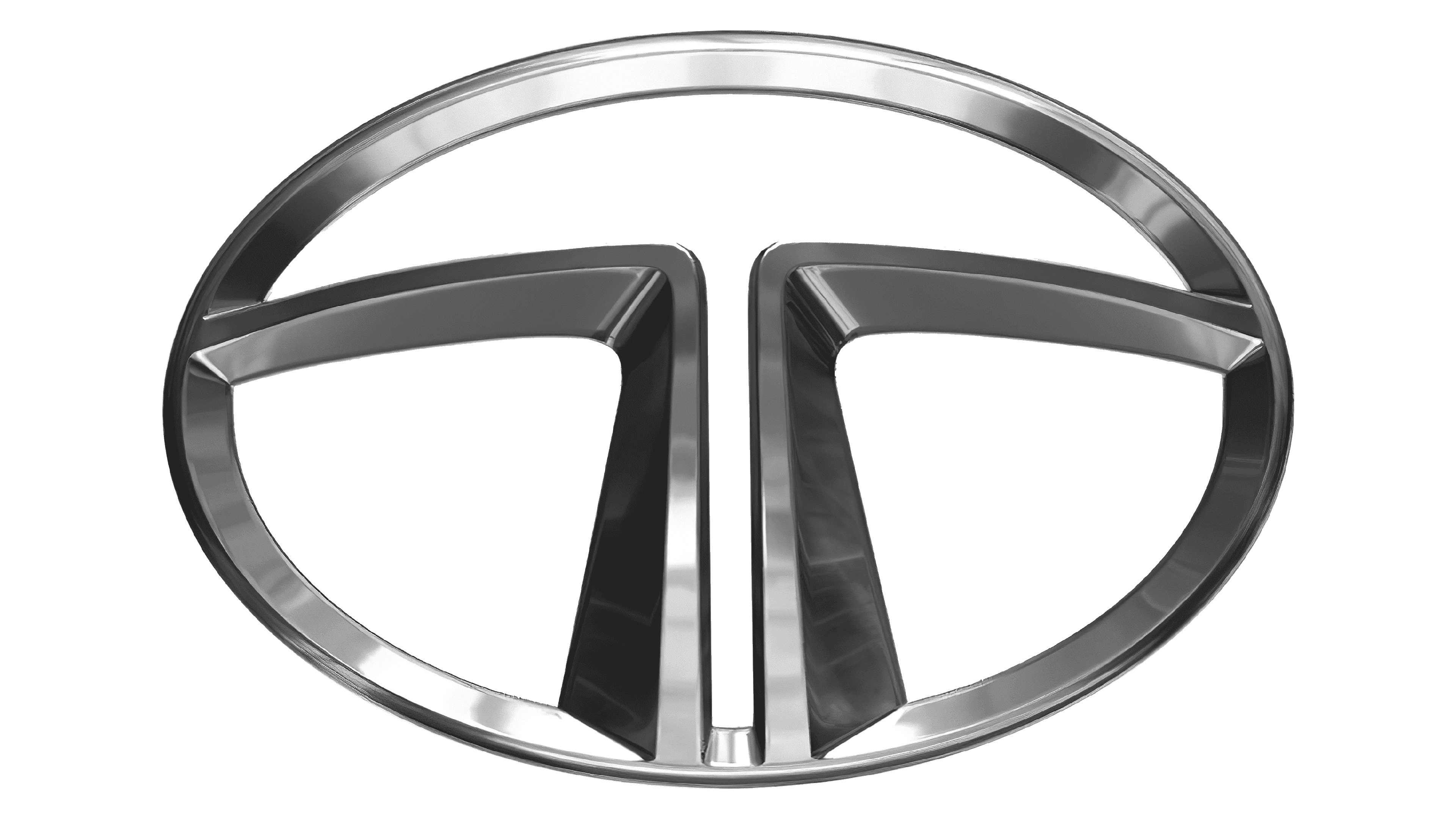
Like its colleagues all over the world, Tata uses its emblem also as a car badge. Like them, the badges of this company are made mostly from metal and have a good deal of chroming. In this case, they turned the lilac elements black, while the ‘T’ lines became silvery, alongside the metallic frame around the oval that the usual logo doesn’t have.
The Legends
Tata creates an insane variety of vehicles, including even trains and buses. For instance, there is a 2008 Tata Nano, which was one of the most prominent Indian mini-cars. Then, there are jeeps like 1991 Sierra and its continuation, the 1994 Sumo (discontinued in just 2019). There are also countless compact cars and even a several pickup trucks.