The name of the Talbot brand comes from the Count of Shrewsbury, Charles Chetwynd-Talbot, thanks to whose financial help from 1903, Clement-Bayard, and later Clement-Talbot cars were exported from France to Great Britain. From 1906 to the 1950s, the company’s own Talbot cars were made. After an almost 25-year hiatus, the Talbot brand re-emerged on the market, already owned by the PSA Peugeot Citroen group, however little interest meant that the production of the Talbot was terminated in 1992.
Meaning and History
![]()
The company’s logo has a rich history, and each of the logos was unique and completely different from the previous ones.
1903 – 1908
![]()
The first company logo consisted solely of the company name in gray-brown capital letters with a thin rim around it. The first and last letter “T” had a common “roof” reminiscent of a spoiler from a car.
1908 – 1919
![]()
The second logo was completely different and had nothing to do with the previous one. The logo was completely blue. In the middle was a lion on a pedestal, and above it was a crown that was nearly the size of a lion. Above the crown was the name of the company in capital letters, and under the lion was the inscription “London” also in capital letters.
1919 – 1935
![]()
This version of the logo had something in common with the previous one, it also depicted a lion with a crown, but now it was painted in white, and the pedestal and crown were red. The lion was positioned in a blue circle with a gray rim, and on the right and left sides of it were curved black rectangles in which “Talbot London” was written. The logo looked like a boxing belt.
1935 – 1938
![]()
In 1935, the logo took on a silver-colored shield-like shape, inside which was a blue circle with a yellow rim around it. Inside the circle was the familiar to us lion with a crown. His image was now slightly simplified. At the very top of the logo (above the circle) was the inscription “Rootes Group”, and at the bottom – “Sunbeam”.
1938 – 1954
![]()
In 1938, the logo was slightly similar to the 1919-1935 version. A yellow-blue circle has been preserved, in which a lion with a crown was depicted. “Supreme” was written above the circle, and “Sunbeam Talbot” was written on the “wings” of the blue circle.
1954 – 1958
![]()
In 1954, the logo had a shield-like shape in blue color with a gray rim around it, but now the lion we got used to was gone. Inside the shield was a diagonal rectangle in which the name of the company was written in black capital letters. In the top left corner the word “Automobiles” was written, and on the bottom right was “Suresnes”.
1962 – 1977
![]()
In 1962, the logo took on a completely different look again. The logo was now in the form of a white square with a blue rim around it. Inside the logo was a blue pentagon, inside which was a white five-pointed star. Under the square was the name of the company in blue capital letters.
1977 – 1995
![]()
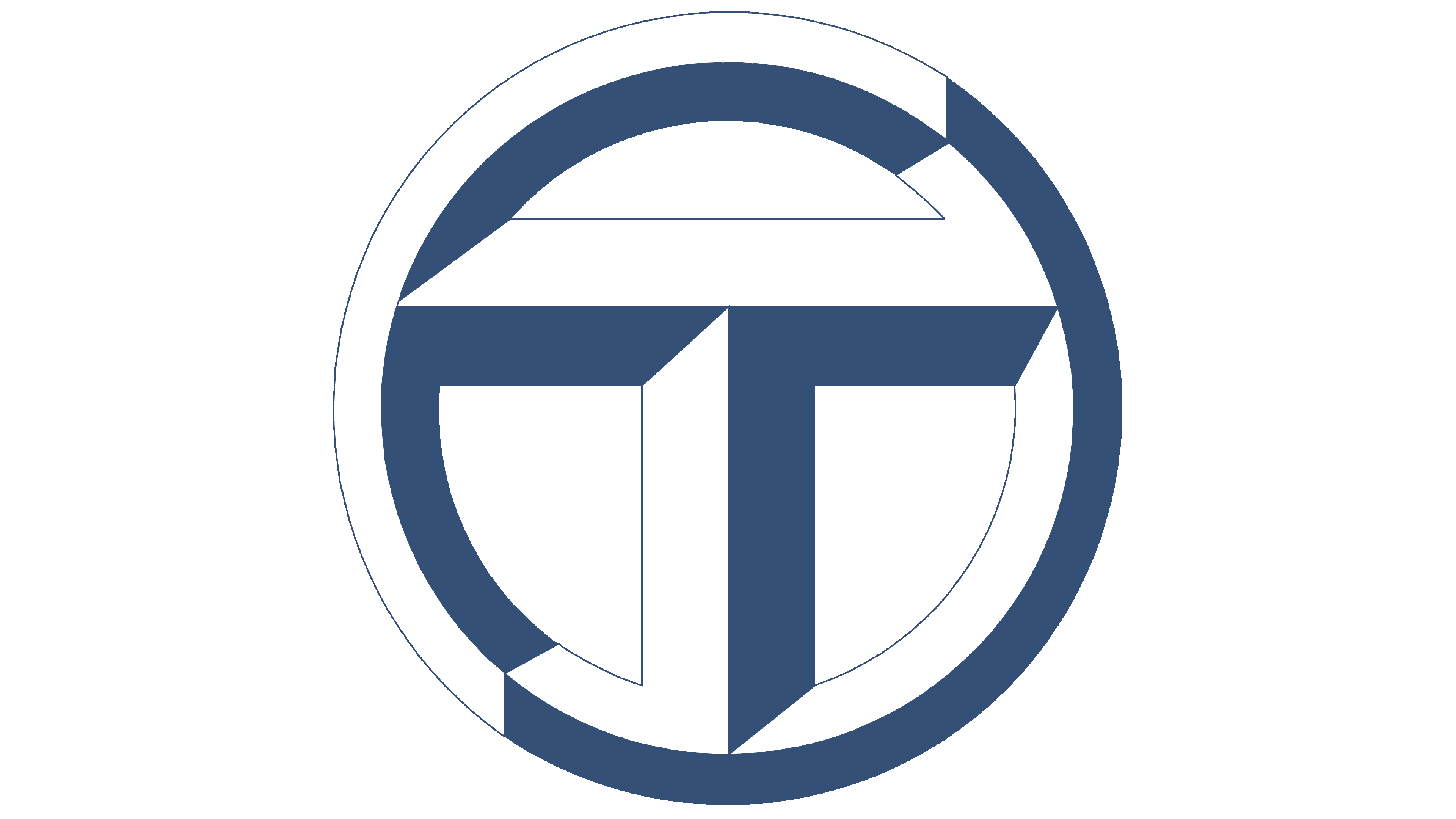
The logo of these years had a round shape in red with a white and blue rim. Inside the circle was the letter “T” also in white and blue tones. Under the circle was the name of the company in blue.
Emblem and Symbol
In the center of the emblem, there is a three-dimensional letter “T” in a circle, symbolizing the name of the creator. For the design of the emblem, the designers used the traditional colors of the French flag.