Smart is a brand of extra small German cars launched by Daimler in 1994. It means several things. First, it’s an extremely new brand on the market, and second – they are sisters with Mercedes and other wonderful brands under this conglomerate from Baden. There’s a lot to tell, essentially.
Meaning and History
In terms of their emblem, however, Smart didn’t have a lot of opportunities to improve their current logo. In its branding as a whole, the company uses tiny-sized elements, like absolute lowercase on all writings. The logo also follows the logic of making everything small to convey the message.
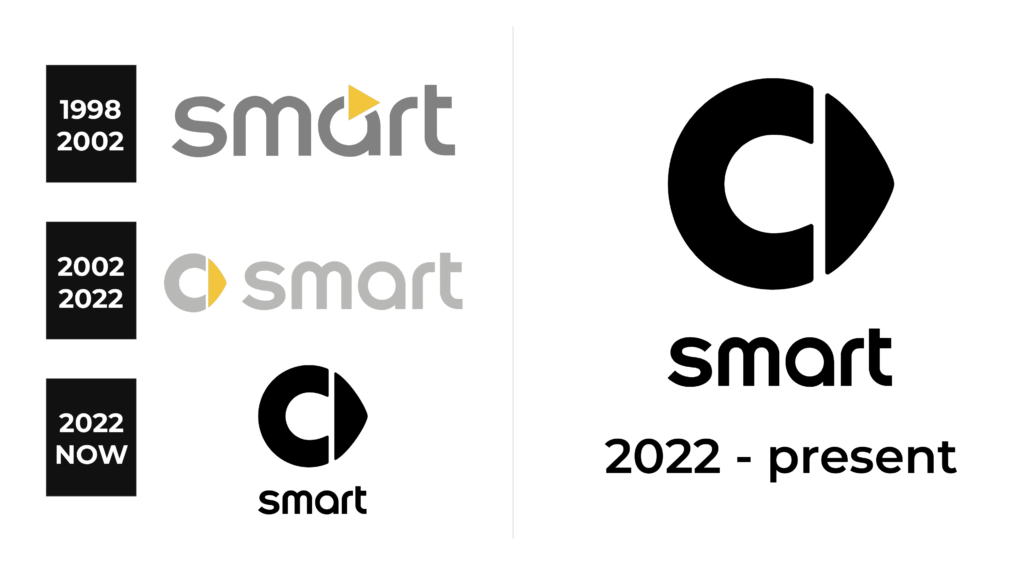
1998 – 2002

The logo of the brand featured its name printed in all lowercase letters using a light gray color. The letters featured smooth curves, which made the logo look friendly. The closest font is Insignia Roman font. The designers also added a small unique detail. The “a” had a small orange triangle placed at the top of it. This color is also associated with happiness, friendliness, and energy. These are great values to have one’s brand to be associated with, especially if the company is trying to make environmentally-friendly solutions.
2002 – 2022
Smart doesn’t seem to have a logo until 2002, when this version was introduced. The current variant is composed of two equal parts: the company name and the emblem itself. They can be used together (in this case, the logo will depict text to the right of the emblem) or separately for various occasions.
The text is exclusively lowercase letters. It was their decision to style their name in small soft letters. In terms of softness, this quality is achieved through a choice of font and color. Color is a very pale grey, so it’s not really striking. The font is characterized by round corners. As a result, there are very little sharp angles in this writing.
The emblem is a lot more sharp and industrial. It’s basically a metal word ‘c’ (in lowercase) with a golden arrowhead stitched to the right side of it. By their own remarks, the letter is supposed to mean ‘cuteness’ or ‘compactness’, while the arrow is a movement and the foresight of the car developers.
The designers in Smart also gave their logo a bit of volume, because this was the fashion of the day – all car manufacturers made their logos 3D at that point. As a consequence, you can see massive tilts on the surface of the emblem, as well as a good dose of lighting gradient.
2022 – Today
The redesign of 2022 has refined the Smart logo, redrawing it in a black-and-white color palette. The iconic rounded emblem with a triangular arrow pointing to the right is now enlarged and placed on top of the badge, while the lowercase lettering in bold black lines is set under the emblem, keeping its typeface from the previous version of the logo.
Emblem and Symbol
This emblem of theirs is also used as a car badge. They put it in front, remove the gap between the arrow and the letter, and give them a lot of chroming. As a result, the badge looks like a ring with an additional triangle in its right side.
Sometimes they just put their name in a specific color in front, if the concept of the car demands it – for instance, if it’s an environmentally-friendly or a futuristic auto.
The Legends
There’s about a dozen of interesting mini-car concepts that Smart came up with. The Fortwo line is the most ambitious – they are pretty much the flagman of the brand right now. And the most recent out of them is Fortwo C453. These are very small and have a 3-cilinder engine.


