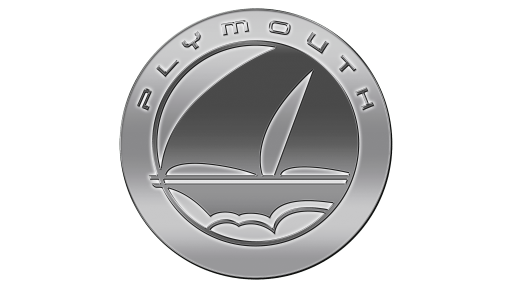
Plymouth is a classic old American brand launched by the renowned ‘Chrysler’ corporation back in 1928. Their focus was mostly on affordable compact cars, sturdy and trusty. The logo changed significantly over the years, but at the very beginning and right before the closing in 2001, they wore a logo depicting one famous American ship.
Meaning and History
The name isn’t inspired by any town name – Chrysler chose it simply because it sounded old and trusty. The same logic applied to their first choice of the logo – the Mayflower ship, which is considered one of the many classic American icons. For a long time, however, they used instead a star inside a pentagon instead.
1928 – 1961
That’s the car badge that was used on the initial and climactic stages of the brand’s existence. It was a shield-like black shape that sported several white images and elements. For instance, the entire logo was outlined four times by two white and black frames.
But more importantly, the inside of the badge featured a ship sailing away from the onlooker. The ship is by all accounts a ‘Mayflower’ – the vessel that carried the pilgrims to America. Many of the components are very well-details, and even the waves that drive the ship are painted white.
Beneath the wave, at the bottom of the page, you can see that Chrysler ‘corporation’ made it clear who owned the brand. This text part has a very strict type, unlike the top text above the ship, which spells the brand’s own name in a very artistic old-fashioned way.
1961 – 1963
In 1961, the company started to fail and a simpler more obscure logo was introduced. This new logo partially featured the elements from the parent company logo.
The central figure of the logo was the car badge inside a wide red rectangle with the wide thick writing ‘PLYMOUTH’ at the bottom. This car badge looked like a three-tip silver star with a much longer top tip.
It was surrounded by a thin silver ring and put on top of the thicker shield of blue (on the left) and red (on the right) colors, which was also framed in silver.
The badge resembles Chrysler logo from the 50s a bit, seeing how their own logo featured two curves – a narrow long and a wide short one – on top of each other.
1963 – 1966
Not much changed in this version, although they got rid of the ring and instead added a huge white frame to the badge in the middle.
1964 – 1994
Since 1964 and until 1994 the brand wore three different logos on different occasions (ignoring the episode in 1964-1966 when there were four distinct logos).
The first logo featured just the deep blue company name (black on the black and white pictures). The font was what’s unique about the emblem. It was very smooth, thin and tilted to the right. In addition, several unnecessary appendages grew out in many points, which made the shape unique and highly recognizable.
1969 – 1994
The second image was pretty much just the Chrysler logo, which until 2014 was just a ‘pentastar’ – a pentagon with thin five-tip star inside. In this version, the pentastar was deep blue, much like the text logo. The star inside was white, however.
1985 – 1994
In 1985, the newly-introduced logo unified both logo versions. It was a blue square with a far stricter bold brand name written in white at the bottom. In the middle stood the familiar pentastar, although the colors were inverted – the star itself was blue (a darker hue) and the pentagon was white.
1994 – 1996
In 1994, all the previous logos were scrapped in favor of just one picture. This time it was a black pentagon with the white star inside (noticeably, the angles were rounded). The shape was encircled in a black ring (the space between the two shapes was white).
There was also a brand name on the top side of the ring. The letters were far smaller, thinner and had a futuristic look – some were slashed into several bits and some ended abruptly.
This logo laid the groundwork for the last logo of the brand.
1996 – 2001
The last logo was pretty much the same, although the ring was now a circle, in the middle of which they put a sailboat encircled by a thin ring. The sail boat didn’t really resemble the Mayflower, but it was clear that it is supposed to be an iconic vessel. The ship didn’t have much detail.
In 2001 Chrysler decided that Plymouth lost its meaning and wasn’t keeping up anymore, liquidating the brand in the process. Therefore, it was the last Plymouth logo, at least for now.
Emblem and Symbol
After the initial badge was discontinued, the brand first gave the obscure 60s symbols to their cars. Afterwards, the cars mostly wore the usual pentastar car badges. Sometimes (like on Neon models) they fixed instead the writing, which wasn’t always in the usual style. Sometimes it was written at bit angle and in thin artistic cursive.


