Maserati is an Italian automobile brand founded at the beginning of the 20th century, that specializes in the production of comfortable sports cars. Also, it is part of the famous Italian automobile corporation FIAT. The company first was headquartered in Bologna, where a sculpture of Neptune, created by Giambologna, was installed in the main city square.
The brand was founded by the 6 Maserati brothers, 5 of whom had devoted their entire lives to cars, inheriting his father’s passion for speed. All in one way or another contributed to the development of the brand that still bears their name.
Meaning and History
The brand name is the surname of the founder, Alfieri Maserati, as well as his many brothers, almost all of whom were involved in the company’s activities. The logo was presented to the public in 1914 when the company was founded. But since that time, for over a hundred years, it has not changed in any way. It just acquired a more modern and voluminous look by virtue of chrome elements.
The company’s logo which represents the famous trident was created by artist Mario Maserati. The inspiration for him became the statue of the sea king Neptune, which was the work of the famous Florentine sculptor Giambologna. This fountain with a statue is located in the main square of the city of Bologna, where the company was headquartered. But the actual idea of a trident has a completely different story.
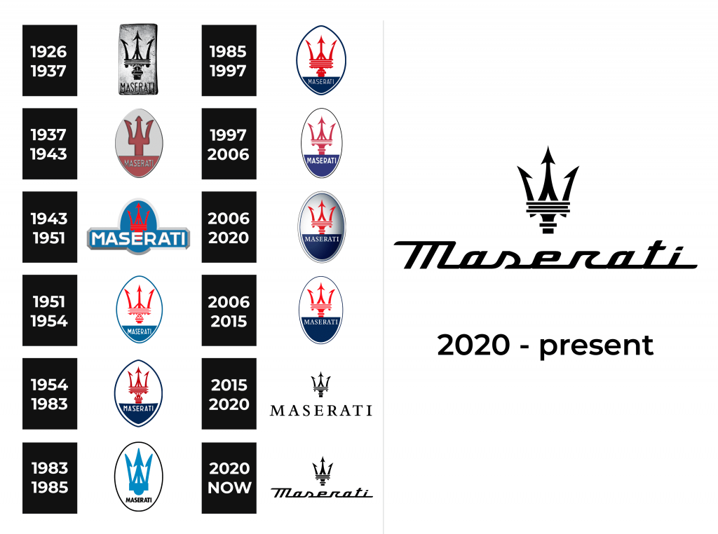
1926 – 1937
The first company’s logo consisted of a black trident set on a vertically positioned metal background. And under the trident was the name of the company.
1937 – 1943
During that period, the logo changed quite a lot. The trident was greatly simplified, and its color changed to red. At the same time, the shape of the logo became oval and pointed at the ends.
1943 – 1951
The trident remained red, but its background changed a lot. It became oval and acquired a blue tint. Moreover, the name of the company became much larger, it began to go beyond the oval.
1951 – 1954
During this time, the logo changed a lot again. Until 2015, it remained almost the same, except for the 1983-1985 period. In 1951, the Maserati logo depicted a red trident on a background that was half blue and half white.
1954 – 1983
During that period the logo got a little bit brighter and became pointed at the ends.
1983 – 1985
Compared to the previous version of the logo, this version has been greatly simplified. The background is completely white, and the trident is blue and more concise.
1985 – 1997
The last laconic logo was replaced by the 1954-1983 version.
1997 – 2006
The logo became oval again and the trident was quite simplified.
2006 – 2015

The company brought steered away from a flat logo look for several years. An addition of a light gray gradient that got darker towards the right upper side gave the emblem a three-dimensional look. The designers further worked on making the logo look fancier and added a second border line. As a result, the logo resembled a medallion.
2006 – 2020
A gradient was added to the logo, due to which it got a certain 3D effect, and began to look voluminous.
2015 – 2020
The version of the logo retains the trident and the company name below it. But now it has all turned black, and the “Maserati” inscription has become much larger.
2020 – Today
The company’s logo which represents the famous trident was also created by a member of the Maserati family, artist Mario Maserati. The inspiration for him became the statue of the sea king Neptune, which was the work of the famous Florentine sculptor Giambologna. This fountain with a statue is located in the main square of the city of Bologna, where the company was headquartered. But the actual idea of a trident has a completely different story.
The updated logo looks even more sophisticated and luxurious. Although the trident was slightly modified ad stretched out vertically, the main change was done to the inscription below. It now featured an italicized, cursive typeface that gave the logo a completely different feel. The fact that the designers were able to create such a stylish and modern brand image while preserving the trident it is known for shows that the company values its rich history and highlights its strong position.
Emblem and Symbol
The trident depicted in the logo symbolizes not only the trident of the sea king Neptune. It actually has a connection with one of the Maserati brother’s life. The logo also symbolizes the pitchfork that once “saved” Alfieri from death. He was attacked by an angry wolf while walking in the woods, but a man in working clothes with a pitchfork came to the aid of Alfieri.
The Maserati logo consists of a red trident on a background that is half dark blue and half white. It symbolizes the trident of Neptune in Bologna and also a sign of the Alfieri’s rescue. Below there is the name of the company in capital letters. The logo was released in 1926 when the brothers launched their first car called Tipo 26.
The Legends
The Tipo 26 is the first racing car produced by the Maserati brothers under their own logo. From 1926 to 1932, 27 cars of this model were produced. As for the Maserati A6 GCS, 4 cars were produced in total. The design was invented by the design studio Pininfarina. The car took part in the famous “1000 miles” races in 1953, which took place in a heavy storm and heavy rain.


