Holden brand was born when an Englishman called James Holden immigrated to Australia and started a horse accessory production in 1856. It was only with his son that this famous Australian car manufacturer started making cars. With the help from Ford and GM, it soon became the #1 car producer in Australia.
Meaning and History
![]()
The company was founded in mid 19th century, but the logo wasn’t designed until 1928, when the brand was already actively involved in making cars. The logo always had an iconic image of a lion rolling a rock on it. It’s said that observing this process pushed early humans to invent the wheel, which added a great symbol value to the brand.
1928 – 1969
![]()
The first version of Holden’s logo was very simple. It only had two colors – black and white – and wasn’t really innovative in its design. The emblem depicted a black nameplate with the word Holden written at the top of it in simple white letters.
Below the writing stood a lion – it didn’t really look like it rolled the stone that was beneath its right front paw, it was just standing on it. Design-wise, it was a fairly detailed animal, with every separate detail. Many parts of the animal were excessively outlined to punctuate the small elements, like the hairs, the fingers, eyes and so on.
The plate had a white outline that culminated in two circles on the right and left, which also held a black ring each. The logo was further surrounded by a decorative frame of black curls and knots.
1969 – 1994
![]()
In the 60s, the emblem was reduced in detail. It now depicted only the lion and its rock, but in an unrealistically simple pose. Only the torso, the head and the front paws were depicted, while the rear paws and the tail area were hidden beneath the bar at the bottom of the logo.
The front paws hugged the stone on two points at the top and the bottom of it, while the stone was just a circle now. The lion also lost a lot of detail – the legs were completely straight, and the hairs were represented by notches all over the animal. The only additional outline was for the mane.
The entire emblem, save for the outlines and some small elements, was red.
1994 – 2020
![]()
With the 1994 variant, Holden found the design they would have until their dissolution in 2020.
This specific logo featured a red circle with the same color as before, the thick white outline and the thinner red line around. The depiction of the lion changed as well. It was located completely inside the red circle.
The lion put one paw on the stone, and the other right beside it. In terms of detail, the animal has a malicious expression with visible fangs sticking out of the wide open mouth. It also has a glorious mane with several red strokes designed to punctuate hair.
In addition, they added a black company name below the emblem itself. The letters are slim and aesthetically pleasant.
2014 – 2016
![]()
While the previous variant continued to be a corporate logo, this emblem was meant for the advertisement purposes. The only real change was the adding of gradient to the logo in an attempt to make it look more 3D. As a result, they added light in the top right corner and a shade in the bottom left area.
The writing below became bigger and bolder, and they also added their slogan below the name, which said ‘let’s go there’ in cursive uppercase.
2016 – 2019
![]()
In this next development, they left the composition unchanged, although they made the entire logo look like glass or some well polished metal. Consequentially, the entire emblem was now a combination of white and grey colors – except for the writing, it remained black.
And the writing itself became smaller again. The slogan even lost its boldness and uppercase in this new design.
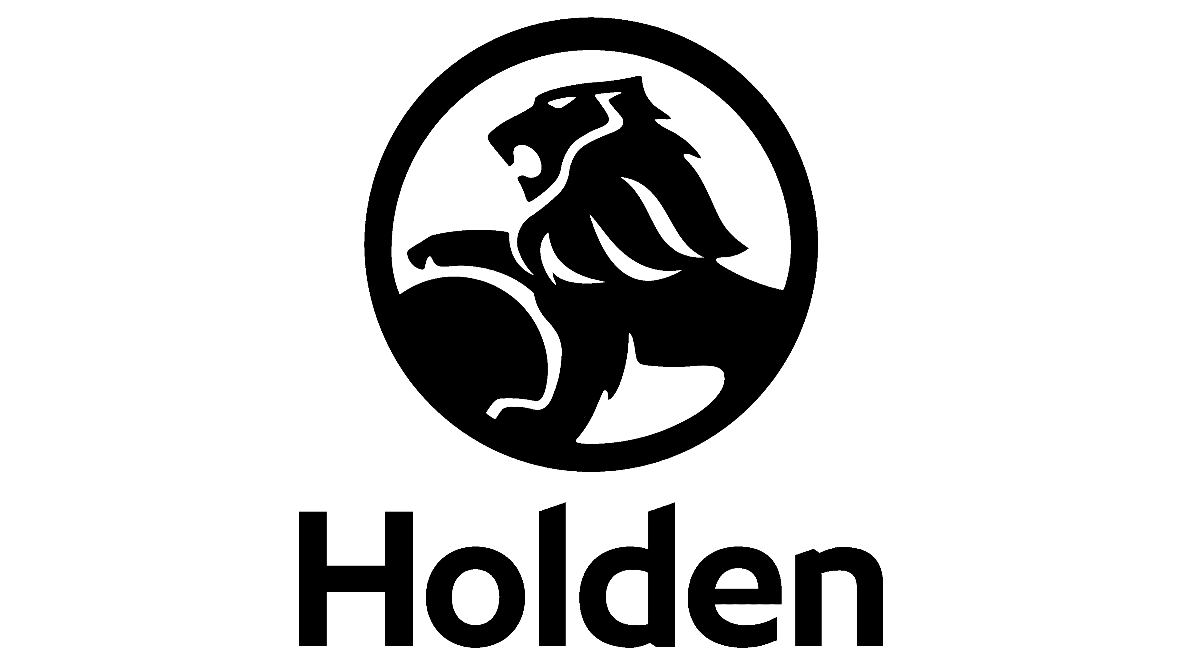
2019 – 2020
![]()
In the last promotional campaigns, the company changed the color palette to black and white. They had a wide black ring around the black lion on a white background. There was no even a text now.
The text was created during the process of brand’s deconstruction, which was probably an attempt to reduce cost before the end.
Emblem and Symbol
As a car badge, they mostly used their latest logo composition turned into metal, much like the 2016 iteration, but with even more grey and polish.
Interestingly, the red 60s version of the logo resembled the emblem of another GM subsidiary Vauxhall, which featured a griffin that snatched the flagpole to the left. They even repurposed some elements, like the tail.
The Legends
Holden is responsible for creating 2 vintage models of what is still considered ultimate Australian people’s cars. The first a 48-215 ‘FX’ line (1948-1953), but the second one became an iconic car for Australians, even though they manufactured it for just 3 years from 1953 to 1956. It was called FJ.