Eagle is a brand that was brought to life by Chrysler in 1987 with the acquisition of American Motors Corporation. The name comes from one of the last models produced by AMC. The first two models of the Eagle brand – the Premier and the Medallion – were developed by AMC in cooperation with Renault. The most famous model, however, was the Eagle Vision (sold in Europe as Chrysler Vision), a mid-range sedan produced in 1993-1997. However, due to unsatisfactory sales results, the production of Eagle cars was discontinued in 1998.
Meaning and History
Throughout its ten-year existence, the company has never changed its logo. The main element of the emblem was the eagle’s head turned to the side. It is worth noting that the eagle was not depicted with wings, as other companies did. The eagle is a popular symbol in logo design. It is associated with America, symbolizes freedom, power and greatness.
What is Eagle?
Eagle is a renowned car manufacturing company specializing in high-performance vehicles. They are known for producing stylish, powerful, and innovative automobiles that cater to enthusiasts and those seeking a thrilling driving experience.
1987 – 1998
![]()
The only logo, used by the Eagle marque during its existence was the stylish monochromatic crest with the head of an eagle inscribed into a horizontally trenched triangle with arched sides. The bird was turned to the left and looked very determined and powerful. Above the eagle’s head, there was an uppercase inscription in a stylish sans-serif typeface, where the massive characters had some of the corners rounded.
Emblem and Symbol
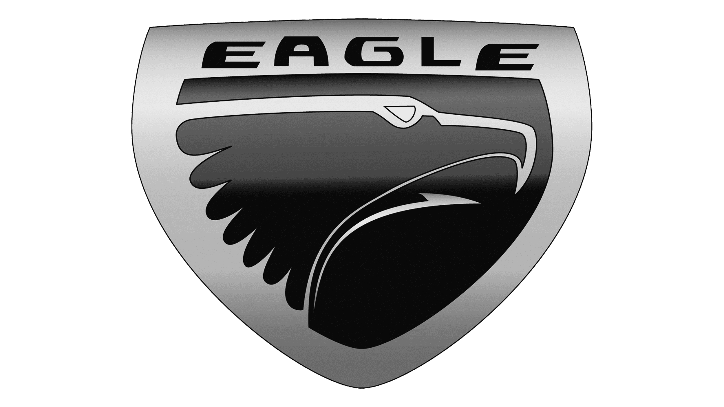
It would be strange if a company called Eagle had a logo with something other than the eagle itself. The logo of this trade brand is a triangle with arched sides in the form of a shield, inside which there is a contour image of an eagle’s head. The emblem is completely black with white contour lines.
Font and color
The sleek capitalized inscription from the primary Eagle logo was written in a custom typeface, which is probably based on such fonts as Presta Variable or Avionic ExWide Black, but with the softened contours of the characters.
In terms of colors, the logo of the car brand was quite strict, and drew its emblem in black and white, which always looks expensive and professional.