Datsun is a daughter company of DAT Motorcar Co., which manufactured mainly light trucks. The brand appeared in 1931 as Datson (the son of DAT). But 3 years later, DAT was bought by Nissan and the idea of the rebranding appeared.
Meaning and history
![]()
The logo of the company conveys the main principle of the brand: “Sincerity leads to success.” The inner part with a blue stripe reflects the rising sun, symbolizing integrity and harmony, transmitting energy and a bright gaze directed to the future. The outer part represents the modernity and reliability of the brand.
1931 – 1935
![]()
The first company logo was in the form of a red circle that crossed out the blue rectangle with the white company name.
1935 – 1976
![]()
The logo used by the company for a little over forty years was based on the original design. It featured darker red and blue, which created an image of a well-standing company. The font has also been changed to a simpler, sans-serif option. This made the name more readable and also supported the impression of a responsible company.
1951 – 1963
![]()
In 1951, the logo was introduced with a white company name with an underscore on a red rectangle.
1963 – 1964
![]()
In 1963, the name of the company was written in blue cursive. Each letter of the name was at a great distance and connected with the subsequent with thin line.
1964 – 1965
![]()
In 1964, the brand’s logo was presented in the form of a name written in bold white letters in a black outline. The letters would be located on a blue background, partially overlapping it.
1965 – 1986
![]()
In 1965, the company name was yellow and all letters were in capital letters.
1970
![]()
There were two versions of the Dutsun logo in 1970. They both were the brand name. It was written in bold white letters with a blue outline. The second version was in black outline. There was no background.
1970 – 1972
![]()
In 1970, the white company name was depicted on an ellipse consisting of black, gray and red colors.
1972
![]()
This version was found in 1972. And it was a black plate. It depicted bold white letters in a gray outline.
1972 – 1976
![]()
In 1972, the logo again consisted entirely of black typeface with sharp corners.
1976 – 1986
![]()
In 1976, the logo was an improved version of the very first logo with a red circle and a blue rectangle.
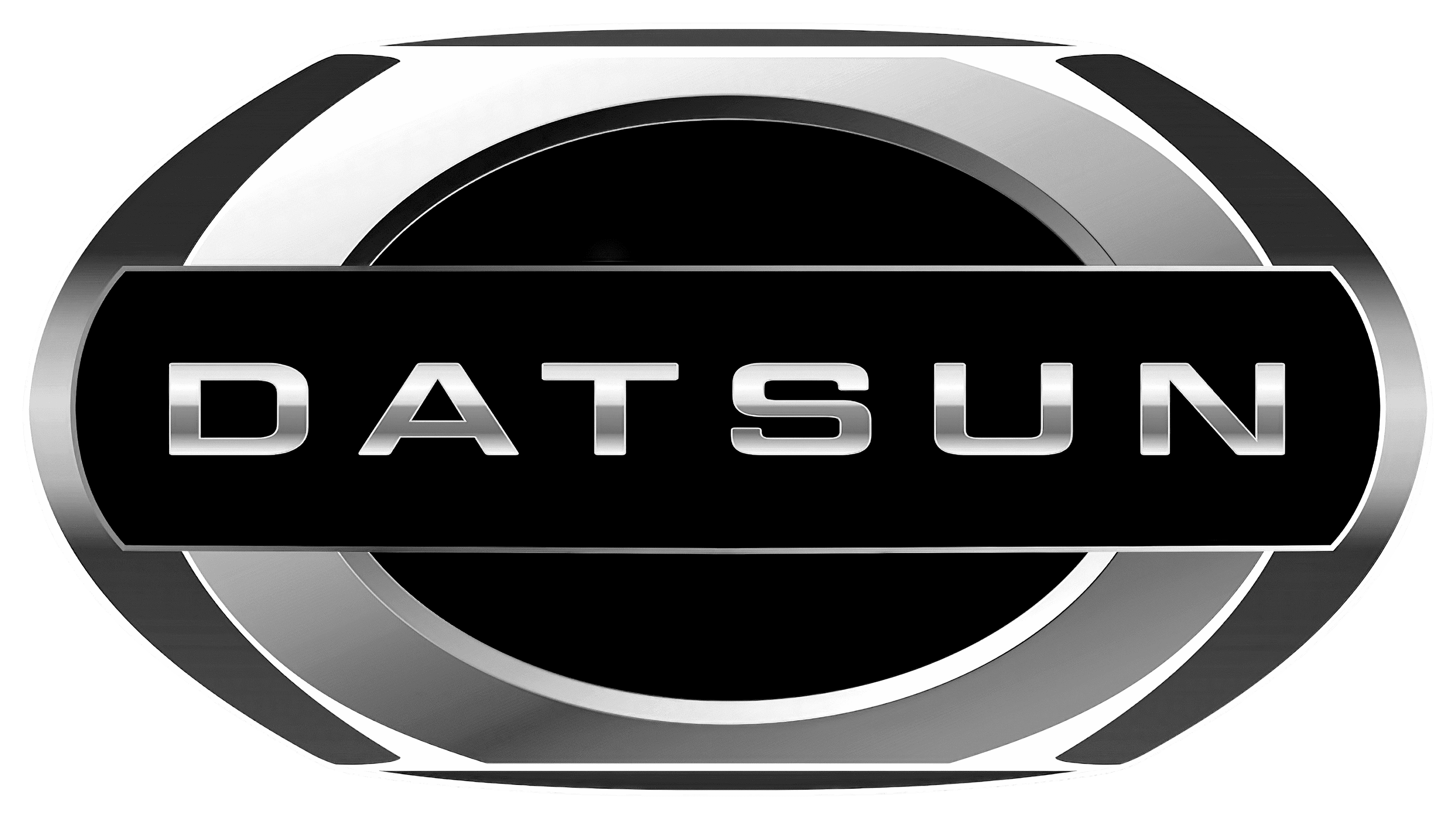
2012 – 2022
![]()
In 2013, changes were made. The logo became three-dimensional and now consisted of a blue circle with a thick silver rim. In the middle was a blue rectangle with a white company name.
Emblem and symbol
The idea for the emblem of the company was the flag of Japan and the expression and famous expression “Land of the Rising Sun”.
The Legends
Datsun 240Z
It’s the real success of Datsun company (still Fairlady in Japan): an inexpensive sports coupe with a metal body, which appeared in 1969.
The Datsun 280Z
The sports coupe debuted on the American market in 1975, and was produced in Japan. In its home market, the car was known as the Nissan Fairlady Z, it was not offered in Europe.