Aston Martin is a British brand of sports cars, one of the few surviving pre-WW1 car manufacturers from this country. They are mostly notable for their luxury cars production, which made them a good candidate when filmmakers had to shoot a prestigious auto in the movie. This made AM very famous in the past century.
Meaning and History
![]()
AM doesn’t really have a deep background behind their logo, they have largely been using their name and the wing imagery. The name, in turn, derives from two components, the first being the surname of one of the founders, Lionel Martin. The other is from Aston Clinton, the village near which they were testing the first models.
1921 – 1926
![]()
The brand first appeared in 1913, but the coming war disrupted the business, which is why they only produced a handful of cars in that period. There was no even a recorded logo for them.
However, the first official logo was created in 1920, and it depicted two black letters from the name – A and M – depicted one over another. The A was located in the middle of the wider M. The tick section in the middle of the latter also made up the central line for the former. The type wasn’t anything special, just a regular serif.
It was mostly used as a car badge for the earlier racing cars, so it was conveniently round, with two thin lines for the outline and a white background.
1927 – 1930
![]()
The next year the emblem evolved, although not much changed. The only two major changes were the adding of the decorative knots all over the emblem, as well as the lessened acuteness of the angle at which the wings looked up.
1930 – 1932
![]()
1927 was the year when Aston started experimenting with the wing images. Their first experiment put the Aston Martin company name on a couple of two joint wings that faced upwards.
The text was styled in a very unique way. Where the wings were coupled stood the big letter M, from the top of which sprawled two lines along the two wings. The left wing held the word Aston, and the right one continued Martin. In both of them, the tops of the T letters were united with the aforementioned lines
1932 – 1939
![]()
In 1932, the Aston Martin logo began to take on a simpler and more modern form. The wings were flattened, and the word sign was placed in a small rectangle in the middle of the logo. The color palette was changed to golden-black, which gave the logo an elegant and luxurious look.
1939 – 1950
![]()
The color palette was changed to silver-black; the shape of the emblem became more angular and distinct. In 1939, the base of the current Aston Martin was designed. It became strict and upscale.
1950 – 1971
![]()
In 1947, the company was headed by David Brown, and in 1950 the logo was changed by adding his name to the inscription. The name was printed above the Aston Martin nameplate in smaller letters. The background color of the emblem is beige with thin silver lines, reminiscent of freedom and lightness.
1971 – 1972
![]()
The “David Brown” logo was still in use, but the color palette was slightly changed. The silver was replaced by gold, and the Aston Martin logo created a sense of luxury like never before.
1972 – 1984
![]()
In 1972, the Aston Martin brand was bought by Developments Ltd, and David Brown’s name was removed from the logo. Another change made to the visual style of the brand over the years was the new color palette. The background acquired a new cool gray tone, while the golden lines remained, but became lighter.
1984 – 2003
![]()
The redesign of 1984 was not the best one, and its result persisted for quite a long time. The logo became more brutal and lost its sophistication due to the thickening of the contours and the increase in the word sign. The letters were narrowed and looked different from the previous versions of the Aston Martin logo.
1987 – 2021
![]()
In this period of their history, AM returned the design to the 1935 situation. It now uses the exact same emblem and the exact same writing as a sub-logo. The only real change is that the name plate became green with a good doze of shade and lighting (meanwhile, the text was repainted white).
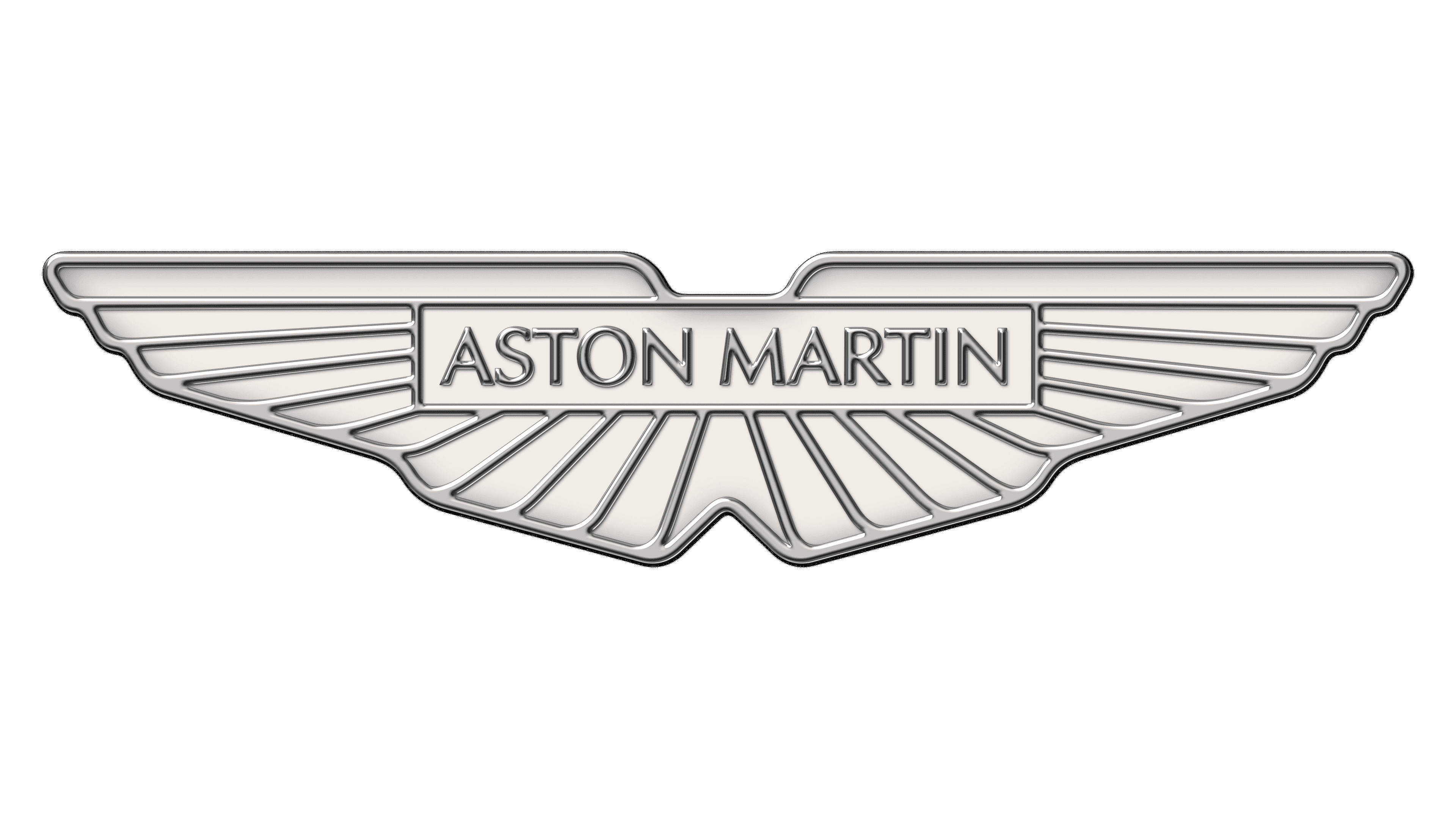
2021 – now
![]()
The new wings are horizontal and impermanent. Many feathers (represented by the rays stretching out from the middle section) have different characteristics, which is why the shape isn’t just a simple triangle as before.
In the middle (above the place from which the rays are coming) stands a white bar with the company name on it in thin, yet distinct, upper case letters. This is important, because sometimes the company used just the name to represent itself. Thus, the writing was a crucial part of the logotype.
The colors on this version were simply white and black (on the lines and the text).
Emblem and Symbol
All AM cars proudly wear a wing-shaped badge on the end of their hoods. However, sometimes the manufacturer can spice the things up, when the green color simply doesn’t fit. For instance, many red Zagato models have a red space in the middle, instead of the green plaque. The same goes for several traditionally black models.
The Legends
Aston Martins are knows as the ‘Bond cars’, as they were featured in a lot of Bond movies since the ‘Goldfinger’, where the agent used a DB Mark 3 with a tracking device. Vantage, Vanquish and DBS then followed until the newer Bonds started preferring Lotus, BMW and Citroen.